Monday, May 10, 2010

The Cape House Script + Design Rationale

The Cape House By: Anna McDavitt

Cape Cod is where my family goes every summer to meet up with our other family and friends. We only get to see everyone in my family once a year and some years not everyone can attend what we call “Beach Week”. To say my family is ridiculous would be an understatement. We are all hicks to say the least, and when we are together the pranks are never ending but unfortunately, we all live in the opposite direction of one another, as hours separate some and full day trips separate others. During the year even my direct family is constantly on different schedules, we rarely see each other until very late at night where homework, work and other events separate us from spending much family time together at all. Going to the Cape is always the most relaxing time of the year; full of barbecues, bonfires, camping, and since our condo is right on the beach, the water is just outside our sliding glass door. Going to our condo in Provence Town, Cape Cod Massachusetts is the time of year where we all get to finally reconnect and recover from our hectic lives to catch up with each other and for a little fun in the sun.

I have been to Cape Cod every summer since I was born for Fourth of July to the following weekend. Over the years family members of mine have passed away but we have also gained others, things have changed dramatically but there’s one thing that always stays the same and that’s the Cape house. The McDavitt family Beach Week is always the reflecting time of each year. When you get into the condo you can’t help but realize how fast time is passing, it always seems just like yesterday we were all together, but in reality, it has already been a year. Every time we are all together our family can’t help but remember the family in our lives who have passed and the time we have had at the Cape house with them. My twin sister, Katherine and I always reflect on just this every time we are there, it’s a simple reminder to all of us to appreciate the people that mean the most to you and to understand how fast time is passing. Beach week, as much as it is relaxing and fun is reminder to be thankful for the good things in our lives and to appreciate how far we have come. In life some of the most important things are the simplest and our Cape cottage is just this for my family. It is important to take out every once in a while to appreciate life and reflect on the past year.

Now a day’s the world does not allow us to have even one day off away from work, school or technology and it is important to take a break and relax for a few days. Beach week for my family is our get-a-way from all the chaos surrounding everyone’s life but eventually it is time for us to get back to reality and embark upon another year. To have a stress free week of fun is exactly what every person needs in order to be happy, everyone needs a break every now and then and the cape cottage is ours.


The Cape House Design Rationale

My rationale consisted of gathering pictures I had of my summers at Cape Cod and ordering them appropriately with my script. I tried to match up some of the funnier pictures with the beginning of my script because the beginning of the script mentioned pranks we pulled and how silly my family all is. Then I new I was going to add the sound of the ocean so I went to Newport Beach with my friends one weekend to a secluded area and got really low to the ground to record the waves, I had to get really low to the ground to avoid as much of the wind as possible but I think it came out well. This was a plan and I think I followed my ideas and my rationale perfectly and the overall product came out great.

Thursday, May 6, 2010

"The Cape House" FINAL


At first, I was extremely stressed out by this assignment. I felt very worried about the time line and I was concerned that with my other classes I would not be able to gather enough pictures and record my voice in enough time. It turned out to be one of my favorite assignments. Once I got going on this project it went rather smoothly. I choose to do this project on my Cape Cod cottage in Provence Town, MA. I choose this to base my project on because I think it is important for everyone to take time out of their daily hassles and take a break to really take life in. We all need to be a little more appreciative of life and the beauty surrounding us. The Cape cottage is just this for me and my family and I really enjoyed gathering photos from previous years at the Cape. It was fun for me too look back and remember what I was like then, the things I was interested in or even the drama going on in my life at the time. It's really ironic how fast we all grow up and this was something that struck me rather hard while doing this project. The slide show came together smoothly and I recorded my voice easily. Although I did have to re-read and re-record my voice reading my essay over a few more times than I would have liked to have to have done, but I'm a perfectionist and I really wanted my voice to come out well. Plus, it took me a few times to get used to recording myself. In class I was told to re-record my voice and talk slower. I am a fast talker, I've always been that way. However, I am always willing to change especially when it comes to becoming more professional. I re-recorded my voice and tried to cut down specific parts of the narrative but, I found that I could not slow myself down no matter how much I tried. This came as a surprise to me because when I try to change something I am usually successful in doing so. I did not change the recording on my sound slide because every time I tried to re-record it I would either mess up the words or would somehow manage to speak faster. I like how my sound slide came out and I feel that compared to the other recordings I could not get the narrative to be much better. Although I have taken speech class I have never had my fast paced talking be brought to my attention. Now that it has been pointed out I am trying to make the adjustments in order to be more professional because what I have to say is important. If I am talking to0 fast people can't pick up on what important things I am saying. Therefore, I want to try and continue to slow my speech down. However, I could not get this recording to come out much better regardless of my many, many attempts. Other than that the project came together very quickly. Once I had all the pieces I saved them and added them along with my song files I made in Audacity to the Soundslides program. I then edited the file names, credits and captions at which point I saved and exported the project and then launched and imported my project onto Filezilla. Soon enough, I was done! I can't believe how much I learned this year about these programs and what really surprised me is how much I learned about myself along the way. I wouldn't expect to do so from only a class but by choosing topics that interest me and pushing through my problems I really learned a lot about myself, Mac's and the various software we used throughout the year. This project exceeded my expectations and I am very proud of my work.

The project is embedded above.
If you wish to open it in a new page click the link below for my final presentation.
"The Cape House" By: Anna McDavitt
Enjoy!

Sunday, May 2, 2010

Website: Adopting A Dog?? What You Need To Know

Click the link below to view my website:
Adopting a Dog?? What You Need To Know...

When the website assignment was announced I was excited to see what we were going to do. As the class was being taught how to run the Adobe Dreamweaver I realized that everything seemed really familiar and that's when it struck me. In Maine when I was in middle school our state gave every middle school student a Mac Book computer. In our computer class we had to do numerous assignments using Dreamweaver. Although this was over seven years ago it was very ironic to me how much the Adobe Dreamweaver software had not changed. It was almost exactly the same and in seven years I feel that the software should have changed dramatically. Therefore, creating a website was not a terribly challenging task. However, I really wanted to devote more time to this project and really create a strong website with a easy to use interface but we did not have time. I know it was extra credit to make the website more colorful and creative, something that I would have liked to do but I just do not have the time. Creating the links and making the headers were interesting but I would have liked to have been able to put more time into the project. I am now beginning to work on the final and with only a week left before finals I am extremely anxious to finish it in time but because of the circumstances I have only met the guidelines given for this assignment, and although I really would like to go above and beyond with this assignment to create a website there is just not enough time. I am satisfied with my work and look forward to applying my skills I have learned thus far from Dreamweaver in the future.

QuarkXPress BiBi Card


The BiBi card was not really challenging just time consuming, I spent about twelve hours working on it. This project challenged me to figure out how to use the tools in QuarkXPress. I had a rough idea and could use specific tools that we had learned how to use in previous classes but this project really forced me to try other tools and play around a little more. I really did not enjoy this project at all and was really focused on just getting through it to the best of my ability. It was really hard because I feel like we did not really have a lot of class time to go over things, although, everyone's BiBi card was different so I feel like there would be too little time to go over questions in just one class alone. I got through it and I really pushed myself to the best of my ability. I am very proud of my work and I feel like although it was a frustrating process I learned a lot by the end of the project. I feel like my BiBi card is pretty similar to that of the original. It was really hard because there were some specific fonts that were not on the computer so after searching for an hour or so and trying different idea's I think I found the right one. It is as close to the original I could get. Other than that I really did not have any more hardships throughout this assignment I just felt like it was very tedious. All and all, I learned a lot by taking this class and learned my way around QuarkXPress even more by doing this project.

InDesign BiBi Card


Using the InDesign program was much easier than QuarkXPress. I was not too excited about having to do both BiBi cards again in a different program however, when I began using the tools in InDesign I realized that they are much easier to use once you understand the program. Before I knew how to use the program I was trying to look for similar tools that were in QuarkXPress that were familiar to me in order to re-create the assignment but everything was different. I was very confused but as I began to pick the BiBi card apart I found out that there were ruler tools that we much different that QuarkXPress. This ruler tool was a neon green line that appeared when moving text boxes. This tool was much more helpful then that on QuarkXPress because you could see where your text boxes were lining up in relation to the surrounding fonts and their text boxes. After I completed matching up the texts I began to add the corresponding colors on the newly created BiBi card. I had to look up how to do these colors but once I figured it out I found a color pallet and that was it, the card was finished. InDesign was a much faster program to use than QuarkXPress and although QuarkXPress maybe more user friendly InDesign was much more efficient. After this project was completed I'm glad I had the opportunity to recreate the BiBi card in a different program because it helped me learn how to use another program as well as apply what I learned in QuarkXPress to help me figure out the most efficient tools to use when recreating the BiBi card in a different program.

Tuesday, April 20, 2010

Brochure: "Adopting a Dog??"


I enjoyed making this brochure. I choose to do a brochure on how to adopt a dog. In my brochure I included topics such has what supplies you will need to antiquity take care of your newly adopted dog, the medical care and cost that monthly and yearly checkups cost, training tips and adjustments/homecoming for a newly adopted dog. This assignment really let me open the doors of my imagination. Since we could pick any topic we wanted I enjoyed trying to find a variety of different topics that interest me, but at the end of the day I am a dog person and since I would love to adopt or buy a dog right out of college I thought it would be informative for me to do some research on the topic. Using Quark Express was much easier for me this time around. Now that we have done other projects in the program I am becoming much more comfortable with the program. After making by boarders and rulers to create an appropriate space for the information for my brochure I went to work. I searched the information all of which I retrieved from the following websites: http://www.paw-rescue.org/before.html and http://www.parl.org/ . The information was pretty self explanatory. I then searched Google Images for some fun pictures and thoughtfully placed them in the most aesthetically pleasuring places. After it was a simple print and I was done. Although the project was relatively easy once I got going on it, the brochure took a lot of time and effort. This week was a busy one for me and although I enjoyed this project it definitely put my Quark Express knowledge and time management skills to the test.

Tuesday, April 6, 2010

Poster: Carrie Underwood

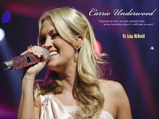
At first I was really confused at how to work this program. But after continuing to see how it worked in class and listening to the lecture we had both days I began to understand how it worked. I really liked creating a poster because it brought everything that I had been working on in the slide show and sound slides to life. Carrie Underwood is my favortie country singer. I just saw her live in Maine over spring break and it was unbelievable. I really wanted to do this project to the best of my abilities and for my first time working with this program I think I did just that. I used a combination of colors from Underwood's third album "Play On" such as green and the attention grabbing yellow. I also used other colors that I thought would really grab someones eye but make the poster aesthetically pleasing at the same time. I did not really need much help with this project like I did others and once I got going on it I finished it rather quickly. Making a draft of what we wanted the poster to look like helped too because it helped me bring my ideas to life and know exactly what I wanted on the poster. I used my mock-up as a guide to help me create the poster but my poster did turn out differently then I originally planned. My poster was going to have a green background with yellow font but as I began creating the poster I realized that it was not as aesthetically appealing as I would have liked so I changed it up, played with colors and fonts and the result was this piece. I added a picture to the bottom left side of Underwood playing the piano that I took myself at her show a few weeks back. I enjoyed this piece of the project very much.

Powerpoint: Carrie Underwood


I have always known how to use the Power Point program, but I have never used it without using the common themes. This part of our project really allowed me to stretch out my power point capabilities and learn different ways of using the program. I really liked this part of the project more than the sound slide and poster. It was easy for me to bring up knowledge about Carrie and show some interesting facts about her career. I really like her music so most of the information I found for the slide show was no surprise to me but how to add sounds, transitions, times and effects were a complete learning experience. In my abnormal psychology class we focus on creating projects for our class and I actually have recently made a project using the Mac Lab and earned the highest grade in the class on my presentation. What I learned during the power point lectures I am actually already using outside of class. This is a really exciting part of this project for me because finding all the information about Underwood took such little time that I had more time to learn more about the program and now am applying what I learned in my everyday life. I think my actual power point came out very well. I really liked it and found myself desiring to put extra work and hours on it because it really interested me. Each slide I did applies to the next and every picture and effect that is on a particular slide matches what is on the same pertaining to that information exactly. For example, my second slide is information about Carrie Underwood, a short bio if you will. The picture I put of Underwood is of her in a simple pose facing the information. This really draws the reader into paying attention to what the art is referring to, Underwood's bio. My overall slide show is a minute long and the song ends perfectly after the chorus. This was really important to me as well because without listening to atleast the first minute of a song the listener can never judge weather they like the song or not. I am a public relations major in communications and this project really represented similar projects that I may be doing after college, this project helped me to remember why I am working toward my communications degree and reinforced my confidence that PR is really what I want to do.

Soundslide: Carrie Underwood


This part of the project was the easiest in my opinion. We took two days to do less than we usually do and in doing so it let me move fast enough to keep up with what is being taught as well as taking notes. As our class was taught I followed along with each step with my own project then helped people around me. By repeating the steps over and over again I began to understand how to create a sound slide better and the information stuck with me. I also began to grasp the importance of the sound slide much better because I was not worried about the deadline, timing, how to work the program etc.. Sound slides are created for the soul purpose to catch peoples attention for their full attention span, about two minutes. Sound slides are an informative and interesting way to teach, explain and make pictures come to life with sounds and pictures. Since I did not create the song I could only legally use thirty seconds of the song. I took the beginning of the song and used the chords up until the songs beginning then looped the under 30 second cut three times to create a pleasant repeated sound throughout the slides.

Wednesday, March 10, 2010

Illegal Music Downloading

Downloading MP3 and MP4 music content has been a controversial topic for as long as I can remember. As a twenty year old college student I download music because of its convenience. It is easy to hop on the computer, open up a program and download a song. Having to get in the car and drive to the closest Wal-mart or CD outlet store is a tremendous hassle only to buy one song. These days there is a wide variety of programs that allow users to download music, movies and other media all from one program. However, these programs are illegal. Although they give users the opportunity to pay for their product the money that should go to the band usually does not. Programs such as Limewire, BearShare and Frostwire do just this. Like most people, I do not pay for the music I download. I use Limewire and although I am given the option to pay monthy for the program I do not buy any music I download. However I do buy my favorite musicians CD's to show my support for the group or soloist. Although I am breaking the law by not paying for most music I own I still do it anyways. I feel as though these musicians are being paid enough money as it is and if I added up all the music I've ever illegally downloaded I'd have spent easily $9,000. Some programs like iTunes allow users to pay per download instead of a monthly fee. Although 99 cents seems like it is a great deal the average media library will be worth more than expected. This concept is certainly a double edged sword. Although the artists are not loosing a lot of money from songs being leaked, they still loose a piece of their income and more money has to come out of their pocket to pay producers and studios to make their tracks. Only a percentage of each song goes to the artist or artists and the other goes to their labels, recording studios etc. But, if we all paid for every song we owned for the minuscule price of 99 cents our music libraries would quickly become worth more than a car. My proposition is that the monthly or yearly fee's for such programs are a better idea to secure that everybody gets their money and that every song is appropriately paid for. The money should go to the same people it would go to if one would buy a CD from the store. Everyone gets paid and everyone's happy. Although users would still be frustrated that they have to pay a monthly or yearly fee people who download massive amounts of music do not have to worry about spending thousands of dollars and people who download less are paying a fair amount without robbing the musicians.

Tuesday, March 2, 2010

Animated Corpse/Carrie Underwood Poem

I did not really find this a challeging part of the project. All I did was at the frames, add my poem choose morph and I was done. At first I morphed my poem the wrong way but then once I realized this it took a simple edit and I was done. I did not have any problems with this project really. The FileZilla part was challenging just because I had never done this before but once we opened Filezilla and choose "File" then "New Site", change student name choose general and follow directions for the host name by adding your RWU e-mail login account information. After following these steps I set FileZilla to choose my GIF on the desktop. After I chose this I went to http://students.rwu.edu/amcdavitt265/movieee1.gif and found my file. I then chose to add a picture in blogger and uploaded the website, the picture worked and after numerous tries using different blogger help tools and HTML codes it worked. My movie appeared and I chose the size to be a medium so it could appropriately be seen and I was done. Once I straightened out the directions and followed each step I played around with blogger (as earlier explained) and I was done. It was all fairly simple. I'm excited to move on to our future project where we will be adding sound to our movies.
My Animated GIF

Monday, March 1, 2010

Corpse


My project entitled "Corpse" was an interesting project to create. I slowly gained more knowledge about Photoshop as I discovered different methods of cropping, scaling and mashing numerous images together. I picked different background images involving nature. I choose such images because I felt they fit the lyrics appropriately. The lyrics are all about not letting your life pass you by and how to not spend anymore time "wasted". This can be looked at from may different perspectives and applied to many different situations in life, the same goes for different poetic scenery and times of the day. I think that by adding all of the pictures together and combining them in this fashion gives the lyrics more meaning. I did not really struggle with this project although it did take a lot of time to get used to but once I played around with the different features and got a hang of things time flew by and before I knew it I was finished.

Thursday, February 25, 2010


I had THE WORST time with this project. Photoshop, word and just the computer it's self was freezing over and over again. I finally realized that I cannot save my work directly onto "Private$" while working. Once I began saving everything onto the desktop then saving and AFTER SAVING moving it to the "Private$" everything started to piece together. I enjoyed picking out my own pictures to use from my photos. I liked looking back on my high school years to now and bringing back old memories and finding large files to use. That's probably the only part I enjoyed, just because I had so much trouble with this project. I began this class being completely computer savvy but I had absolutely no clue how to use a Mac or Photoshop. Through reading through the book, asking questions and receiving helpful advise from my peers I think I really nailed it. My favorite picture that I chose to put in this blog was what I call "LOVE". This is a picture that I took of Jennifer Nettles and Kristian Bush AKA Sugarland at a concert in August. My friend Kali and I were so unbelievably excited for this show and it was so well put together. This was their opening, it blew me away and I still cannot believe I shot such a beautiful photo. I love this band so much and have a tattoo because of them but aside from that this picture I think is just so full of color and emotion I could not help but pick it as my favorite. By the end of this project I began to feel much more familiar with the Mac computer and Photoshop and my second project seemed to fly by. I'm glad I got through a project that to me, with the little knowledge I had, seemed impossible.


Font Poem: "Wasted" by: Carrie Underwood.

The font poem I found to be my favorite project thus far out of the two. I really did not have any problems with it. What I chose to do was a quote from a song. This song is called "Wasted" by Carrie Underwood. I love Carrie and all of her music but I figured that this would be a fun song to play around with. I really like to be creative and break the boundaries so I enjoyed being about to play around with fonts, colors and spaces to create a overall picture. I finally figured out my computer issues from the last assignment and am now satisfied with my work and comfortable with how to create such work in Photoshop. After hours of reading along with trial and error I have finally began to understand the methods behind such assignments. For this assignment I simply picked a song and decided on fonts and colors depending on what was appealing to me and how I felt the lyrics should be portrayed. This is what I came up with, I hope you like it :)

Thursday, January 28, 2010

TEST

TEST