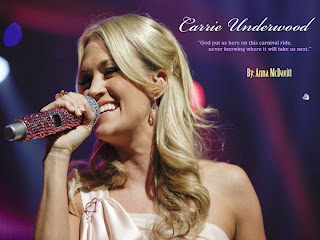
I have always known how to use the Power Point program, but I have never used it without using the common themes. This part of our project really allowed me to stretch out my power point capabilities and learn different ways of using the program. I really liked this part of the project more than the sound slide and poster. It was easy for me to bring up knowledge about Carrie and show some interesting facts about her career. I really like her music so most of the information I found for the slide show was no surprise to me but how to add sounds, transitions, times and effects were a complete learning experience. In my abnormal psychology class we focus on creating projects for our class and I actually have recently made a project using the Mac Lab and earned the highest grade in the class on my presentation. What I learned during the power point lectures I am actually already using outside of class. This is a really exciting part of this project for me because finding all the information about Underwood took such little time that I had more time to learn more about the program and now am applying what I learned in my everyday life. I think my actual power point came out very well. I really liked it and found myself desiring to put extra work and hours on it because it really interested me. Each slide I did applies to the next and every picture and effect that is on a particular slide matches what is on the same pertaining to that information exactly. For example, my second slide is information about Carrie Underwood, a short bio if you will. The picture I put of Underwood is of her in a simple pose facing the information. This really draws the reader into paying attention to what the art is referring to, Underwood's bio. My overall slide show is a minute long and the song ends perfectly after the chorus. This was really important to me as well because without listening to atleast the first minute of a song the listener can never judge weather they like the song or not. I am a public relations major in communications and this project really represented similar projects that I may be doing after college, this project helped me to remember why I am working toward my communications degree and reinforced my confidence that PR is really what I want to do.

 I enjoyed making this brochure. I choose to do a brochure on how to adopt a dog. In my brochure I included topics such has what supplies you will need to antiquity take care of your newly adopted dog, the medical care and cost that monthly and yearly checkups cost, training tips and adjustments/homecoming for a newly adopted dog. This assignment really let me open the doors of my imagination. Since we could pick any topic we wanted I enjoyed trying to find a variety of different topics that interest me, but at the end of the day I am a dog person and since I would love to adopt or buy a dog right out of college I thought it would be informative for me to do some research on the topic. Using Quark Express was much easier for me this time around. Now that we have done other projects in the program I am becoming much more comfortable with the program. After making by boarders and rulers to create an appropriate space for the information for my brochure I went to work. I searched the information all of which I retrieved from the following websites: http://www.paw-rescue.org/before.html and http://www.parl.org/ . The information was pretty self explanatory. I then searched Google Images for some fun pictures and thoughtfully placed them in the most aesthetically pleasuring places. After it was a simple print and I was done. Although the project was relatively easy once I got going on it, the brochure took a lot of time and effort. This week was a busy one for me and although I enjoyed this project it definitely put my Quark Express knowledge and time management skills to the test.

